122 Rules by Deek Rhew

Sunday, February 21, 2016

A Shot of Bourbon by A.C. Land - Cover Reveal

Today, I have the pleasure of revealing the cover for BookFish Books' latest young adult contemporary novel, A Shot of Bourbon by A.C. Land!

Before we get to the goodies, let's take a look at what the story is about!

Back Cover

In the little highway town of Bourbon, Missouri, deadly secrets lurk behind Southern charm. 

Seventeen year old Charli Valentine didn’t expect to spend the last few weeks of summer break nursing a broken heart, icing a black eye, and watching her ex kiss another girl. Since being a good girl has gotten her nothing but heartache, Charli decides to give rebellion a try. She pigs out, drinks, and hangs with Luke Parker, the son of the infamous Bourbon Butcher. 

But there’s more to Luke than meets the eye. His tough exterior and terrible dialect hide a good person despite his bad boy reputation. No matter how hard he tries to fight it, Luke is drawn to Charli’s innocence and finds her clumsiness too charming to resist. Though they’re from opposite sides of the tracks, neither can resist the magnetism drawing them together. 

When Charli discovers a box in her mother’s closet, she pieces together the truth about Bourbon’s past and uncovers a deadly secret about her family. And once Luke learns of it, he vows to protect Charli no matter the cost. 


From the real Bourbon, Missouri
Photo Credit: BGI Photography


Sounds like an intriguing tale. Love, murder, and a mystery in small town America. 

And who wrote this engaging tale? A.C. Land!


About The Author

Author of the Bourbon series, A. C. Land has been a lover of stories since she first read about Peter Pan giving Wendy an acorn and teaching her to fly. She always dreamed of telling big stories about small towns.


Residing on a cattle farm in Missouri, A. C. loves playing with her rambunctious Jack Russell, Riley, making decorative cakes, taking pictures, drinking pumpkin spice coffee, and hanging out with her nephews.

Find A.C. online: 


And now, for the moment you've been waiting for...the cover!
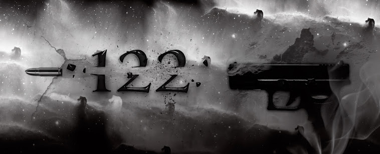
Cover Reveal

Cover Design: Anita at Racepoint

Be on the lookout for A Shot of Bourbon
available March 2016!

Saturday, February 6, 2016

Ellie Sipila from Move to the Write on Book Design and Digital Book Production


Book Design and Digital Book Production

Today I'm fortunate to get to host Ellie Sipila, from Move to the Write. She is the one responsible for the beautiful layout of Birth of an American Gigolo.

Birth of an American Gigolo's amazing layout

What most authors and readers don't think about is just how much work goes into making the interior of a book pleasing to the eye and easy to handle. This is because of the unsung heroes that pour their time, sweat, and expertise into making it so you don't have to think about!

Take it away, Ellie!


I know. What an unglamorous side of the literary world—design and production. Yawn! I mean, we all love books—of course we do!—but after the author writes the thing, isn’t it the editors who do most of the work? They tweak the story, wrangle the words, clarify things, get all the thoughts making sense. Who really cares about design and production?

Um…(*waves*) I do. And whether you know it or not, you.

When I mention to people that I design books, I’m fairly sure 99% of them think I am a cover artist. Well, yes, that’s part of it, but only a very small part. Don’t believe me? Open any book on your shelf and you will see the work of a designer—or better yet, you won’t see anything at all. But it’s all there.

Here are some of the things you’re not seeing: Running heads and feet, part and chapter openers, pull quote styles, end notes, footnotes, forwards, title pages, folios, copyright pages, body text, image placement, captions, charts, page numbers, typeface choices, binding type, cover type, margin widths, bleed, slug, leading, tracking, kerning, orphans, widows, dingbats, glyphs, gutters, bleed…

Tired yet? I am too.

The thing is, when you think of a book designer’s job, you probably don’t think about any of that stuff. And guess what? That’s kinda the point. While the cover is there to get you to do something—buy the book—the inside design is there to make you not do something—get distracted.


It is the designer’s job to make sure the author’s words are laid out in a way that is clear, logical, and pleasing to the eye. It’s hard to absorb the author’s message when you cannot read the words because the designer has chosen a font that is 98% hieroglyphics. It’s hard to pay attention when the pull quotes are overpowering the tiny body text that runs into the gutter, or the table is split across two pages. Did you know that, often, the bottom margin width is deeper than the others? This is because some kind designer thought, Hey, wouldn’t it be more comfortable for the reader to have space down there to put her thumbs? That’s right, my reading friends.

That little bit of comfort was thought of by a designer.

You may buy a book based on its cover, but you will enjoy it because of the designer (and the words. I suppose they’re important too or whatever. Mostly it’s the design though. I swear it).

Production comes in two main types—print and digital—and without it, there would be no book.

Primarily, I work in digital production. This involves quite a bit of HTML and CSS code writing that will be packaged into an epub file that you can download onto your computer, phone, e-reader, or tablet. If you have an e-reader, open up your latest squeeze.

Can you go into the table of contents, tap on a chapter title, and be magically whisked to that spot in the book? Do you know who hooked that up for you?

Have you ever come across a word you weren’t too sure about, so you touched it and a definition popped up? Guess who did that?


Have you ever come across a digital book that featured an audio file, fancy background colour, drop caps, images, links to outside resources, maybe even a video? Have you ever read a digital book that was vibrant with colour and you thought, WOW, the colours in this image look AMAZING compared my print version of this book! Well, that’s because the person who produced that e-book understood the difference between RGB colour and CMYK.

HTML coding is constantly changing, which means a person who works in digital book production must be constantly updating their skills. You may not even notice how beautifully your new e-book renders on Google Chrome but how horribly it does on Firefox.  But there is someone out there who is striving to fix that, dear ones. And you know who it is.

Want to learn more? Check out my website: www.movetothewrite.com

Facebook: https://www.facebook.com/movetothewrite/

Have a question or want a quote? Contact me at ellie@movetothewrite.com